Community Visualizations is a tool for visualizing the collected data and creating your own diagrams, for every unique situation. This means you can display Yaware.Timetracker statistics in new ways. To do this, upload the data from the time tracker to Google Data Studio.
- . Go to the Google Data Studio homepage.
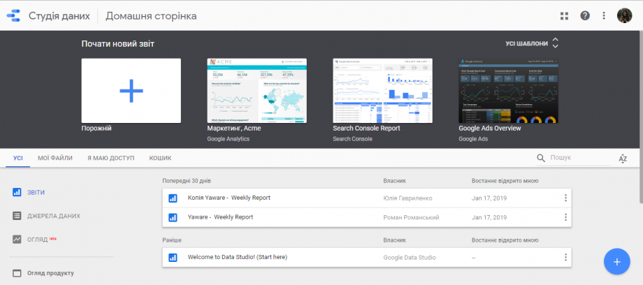
- Click the “Start New Report” button.
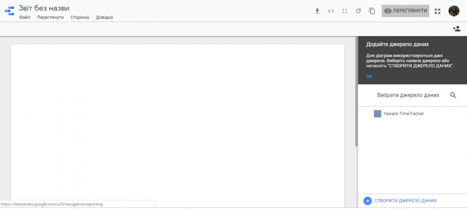
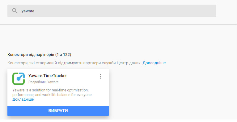
- Click the “Create Data Source” button. Enter “yaware” in the search box. Click “Select”.
- Enter your Yaware.Timetracker account name and password. The best way is to connect to Data Studio directly through the mail that is linked to your Yaware.Timetracker account. Then the data is integrated automatically.
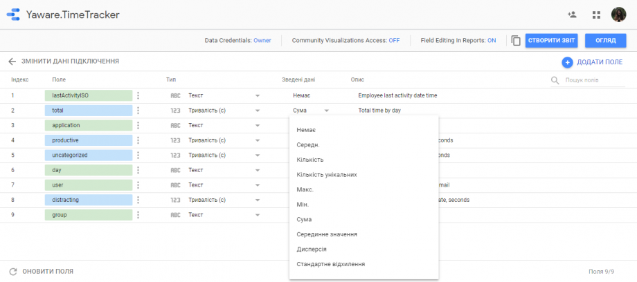
- Select the data you want to display and click “Create Report”.
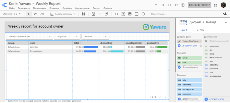
You can combine data from several sources, add graphs, charts, change the layout and theme. In general, do whatever you want in order to visualize the collected statistics in the way you need it.